Review: “What Shadows”, by Chris Hannan, directed by Roxana Silbert

What Shadows, at the Park Theatre, London

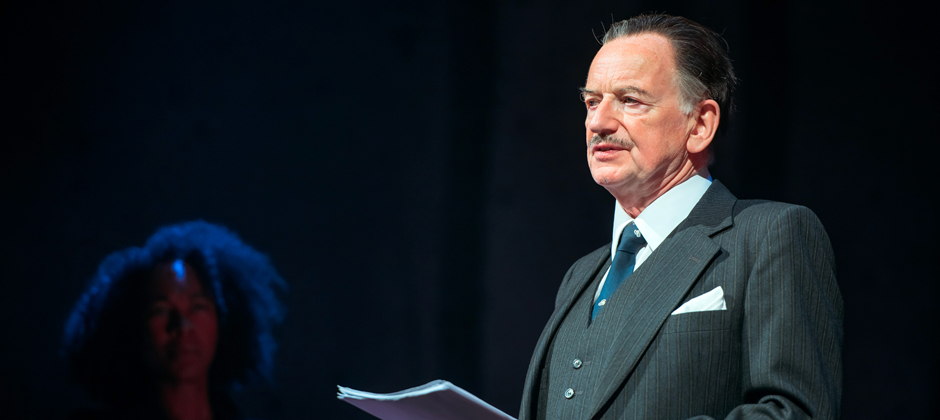
Ian McDiarmid as Enoch Powell. Photo (c) Park Theatre.

Script by Chris Hannan.  Directed by Roxana Silbert

The minimalist set of What Shadows, and the intimate space of the Park200 stage, result in a strange juxtaposition: that of the unassuming setting against the universal ideas of the play. Certainly, Enoch Powell’s Rivers of Blood speech – what this play centres on – was divisive and to this day creates questions relevant for a post-UKIP, post-Referendum Britain. Chris Hannan’s script is the sort one can imagine to be used as a set work for senior school drama pupils, and in the hands of a lesser cast could have become trite and self-conscious, precisely because of the fundamental themes the characters have to grapple with. The superb cast ensures this never happens.

Amelia Donker and Joanne Pierce in What Shadows. Photo (c) Park Theatre.

Ian McDiarmid portrays an unwavering and monolithic Enoch Powell, a man of his time and milieu, who is not quite such an antagonist as to be totally unrelatable. Joanne Pierce’s Sofia, recalled from her academic and social exile by Amelia Donker’s Rose Cruikshank, is likeable not only in her flaws as she climbs her way out of the pit of her previous failure, but also in her honesty of how these have brought her low.

Donker handles, with great sensitivity, a Rose Cruikshank who realises that she, too, has behaved in a racist manner, and in concert with Pierce creates a moment of revelation that is almost searing. The recognition that we are all prejudiced – no matter how hard we try – was for me palpable, and surprising in its poignancy.

The pantheon of characters works brilliantly to bring texture to this tapestry on identity. Paula Wilcox’s Grace Hughes – the last white woman on her street in Wolverhampton, who is herself a central character in Powell’s Rivers of Blood speech – contrasts with her neighbour (and later, her husband) Saeed, played by the prolific Waleed Akhtar. Ameet Chana’s character Sultan provides a comic foil in some heavy dialogue, while also highlighting the “two lives” and split identities that immigrants have. Wilcox’s sensitive Marjorie Jones plays off well against Pierce’s strident and hard Pamela Powell.

Nicholas Le Prevost’s Clem Jones, an uneasy bystander and reluctant friend and advisor to Powell, is by far my favourite character. Many can relate to the discomfort felt when an old friend changes, gradually, becoming less recognisable, and the inner struggle we face when deciding whether they still get our loyalty. Clem Jones sees the dangers of Powell’s position, but is torn between helping his friend, and not allowing his racist discourse to be promoted. He chooses the former, fully aware that he is aiding and enabling the divisive speech to be picked up by the media, and the irreversible consequences of this.

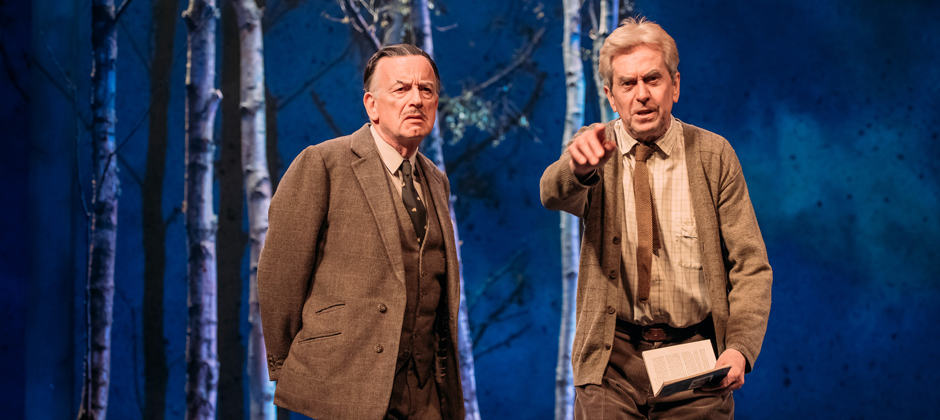
Ian McDiarmid and Nicholas Le Prevost in What Shadows. Photo (c) Park Theatre.

Cast:

IAN MCDIARMID – ENOCH POWELL
NICHOLAS LE PREVOST – CLEM JONES
AMELIA DONKER – ROSE CRUIKSHANK & JOYCE CRUIKSHANK
PAULA WILCOX – GRACE HUGHES & MARJORIE JONES
WALEED AKHTAR – SAEED
AMEET CHANA – SULTAN & DOCTOR SHARMA
JOANNE PIERCE – SOFIA & PAMELA

Review: Quentin Blake’s BFG and Kitty-in-Boots Illustrations

I’m a big fan of illustration as an art form, so couldn’t resist seeing the dual Quentin Blake exhibitions of his drawings and paintings for The BFG (written by Roald Dahl) and The Tale of Kitty-in-Boots (written by Beatrix Potter) at The House of Illustration in Granary Square, King’s Cross, London. I was particularly keen because you get to see his work “in the flesh”, as opposed to reproduced in books, and to get an idea of his drawing and painting methods.

Having previously illustrated a book myself, where I did my drawings in A3 (or larger formats) which were then scaled down to retain detail, I had wanted to know: His works are often very detailed, so does Blake draw huge images and these get scaled down? Or does he draw to scale what is going to get published? And, what kinds of pens does he use? And these two exhibitions didn’t disappoint, even though I approached it with a bit of a forensic mindset. For Blake fans, these two exhibitions are highly recommended.


Quentin Blake's materials on display at the House of Illustration

Quentin Blake’s materials on display at the House of Illustration

The first, The BFG in Pictures, features his work for The BFG, including original artworks from the first edition of the book, and some background on how the first illustrations were commissioned. It goes on to include further illustrations created for subsequent editions, with reference made to consultations with Dahl about what the BFG should wear. It also includes black-and-white pen drawings showing off his loose flair and his seemingly effortless ability to capture the spirit of his characters. We see the transformation of the BFG character over time, settling into the figure most of us know today.

Quentin Blake's work on Kitty-in-Boots on display at the House of Illustration

Quentin Blake’s work on Kitty-in-Boots on display at the House of Illustration

The second exhibition, of his work for The Tale of Kitty-in-Boots, opens with a table containing Blake’s materials, and a work in various stages of progress (which as an artist is an engrossing installation to see). The first part of the exhibition also includes the single drawing Beatrix Potter did for the frontispiece of the book, and a page from her manuscript, which was discovered in the V&A in 2014. This exhibition shows off a substantial collection of original artworks by Blake for the book, and certainly sated my curiosity about what materials he uses, and what sizes he works in.

This dual exhibition is a wonderful insight into how he works. Blake works to scale – creating the illustrations at roughly the same size as they appear in print – and works in pen, of the sort involving nibs and pots of ink, which explains the rough mark-making he sometimes employs in depicting characters.

I started out believing Blake had a talent for being lucky in throwing together random lines which just ‘work’. Some lines are haphazard, some clear and certain, some lose their ink halfway and become fainter lines, which then adds to the richness and subtleties of his characters. But soon I realised that these lines that appear careless and random are in fact very deliberate, despite their whimsical, free-flowing appearance. His lines are anything but careless and unconsidered; they embody movement and describe the character personality and physique. Not one of them is misplaced.

Quentin Blake's work on Kitty-in-Boots on display at the House of Illustration

Quentin Blake’s work on Kitty-in-Boots on display at the House of Illustration

He draws first, then adds washes of colour. I was startled to discover the colour is applied with as much care and deliberate, decisive action as the lines. It takes a lot of practice to make splotches of colour look both unplanned and yet perfect for the artwork: it is something I grapple with fairly often, as I venture into watercolours. Too much consideration and planning can lead to a tired and over-worked surface, as you kill the spirit of the piece with too much attention.

It takes great skill to make illustrations look so easy. That is the sign of a consummate artist, in my view. So, if you’re up for seeing some work by one of the great living artists of our time, head on over to The House of Illustration, before the exhibitions end!


The BFG in Pictures is on display until 2 October 2016. The Tale of Kitty-in-Boots is exhibited until 5 February 2017. http://www.houseofillustration.org.uk/whats-on 

Review: “Digest” by Tisna

London-based Dutch artist Tisna Westerhof is exhibiting works at the Dutch Centre, at Austin Friars in the City of London, as part of her exhibition entitled “Digest”.

IMG_0002

From ‘Costume Drama’ by Tisna Westerhof.

This cleverly-titled exhibition – playing on the word’s double meaning, relating to food and digestion, and also to a compilation of material – brings together large embroidered portraits from her ‘Costume Drama‘ series; screen prints of Delft Blue vases from ‘Vessels‘; ceramic tiles from her ‘Delft Blue‘ collection; and works from the original ‘Digest‘ series: paper plates decorated with images from newspaper reports in Delftware style.

“Digest” is a clever reference not only to the eclectic nature of this collection and of course to the Delft Blue plates and vessels that are carriers of food and drink about to be digested, but also a strong nod to the compilation of news stories from the last 24 months, evident in the works. These include news events and their associated slogans, such as the Black Lives Matter movement, the loss of Flight MH17, Free Our Girls, the Ebola Virus epidemic, Je Suis Charlie and the war in Syria.

IMG_0004

Works from ‘Delft Blue’ by Tisna Westerhof.

The gravitas of the ceramic tiles in ‘Delft Blue‘ is felt thanks to the fact the medium harks back to centuries of Dutch cultural tradition, but jars with the somewhat banal subject matter: modern cityscapes interspersed with larger-than-life child figures, playing in the Thames, hanging off buildings, swimming in floodwaters. The manner of the representations – detailed cities, almost photographic in depiction, against the simply-drawn children – only adds to this dissonance.


These conjoined subject matters are absurd together, but the nonsensical juxtapositioning left me wondering: what would children – these giant children in the paintings – make of our odd, modern lives?

Perhaps the addition of the children in these painted tiles helps create even more mental distance between the viewer and the cityscapes, and this distance helpfully lets us consider the ceramics as perhaps a modern representation of life, through Delft, rather than pretty decoration.

IMG_0007

From ‘Digest’ by Tisna Westerhof.

The plates painted in the Delft Blue style were a particular favourite of mine. While the plates were sadly only made of paper, I did find that the blue paint does indeed help mimic the old ceramic panting style. Plus, the disposable nature of the plates is perhaps preferred to ceramic, as it helps to highlight the throwaway nature of modern life.


Again, the absurdity and banality of juxtapositioning the “ornamental” identity of painted plates with some fairly sobering topics, produces dissonance and gives the viewer pause.

A painting of the Nigerian schoolgirls captured by Boko Haram is encircled by decorative flowers; crowds waving ‘Je Suis Charlie’ signs are framed by lace and more blooms; body bags filled with victims of Ebola, and medical

IMG_0009

From ‘Digest’ by Tisna Westerhof. 

workers in protective bodysuits, are surrounded by a pretty pattern.
Part comment on our collective desensitisation to the horrors in the news, part sociological record of our times, these plates are so original, if not in subject matter, then certainly in execution and format.


I thoroughly enjoyed puzzling over these works; hopefully you will too.

For full details of the works on display, please visit Tisna’s website at www.tisna.com.

IMG_0012

From ‘Digest’ by Tisna Westerhof.


Review: Royal Academy Summer Exhibition 2016

In a surprise twist of plans, I ended up going to the final day of the Royal Academy Summer Exhibition today. (I was meant to be going on a blind date, who cancelled on me with 30 minutes to go; so I took matters into my own hands and took myself on a date to the RA!)

There is something electric in the brave eclecticism of the Summer Exhibition, that has made it a staple of the annual London cultural diet. It’s not often you see works by esteemed, well-known artists alongside those of emerging artists, on quite such a scale. Over 1,200 pieces are on display, in media ranging from pencil and pen, to acrylic and watercolour, and from sculpture and architecture to video, and everything else in-between.

SELF PORTRAIT AS CHARCOAL ON PAPER by Zatorski + Zatorski

SELF PORTRAIT AS CHARCOAL ON PAPER by Zatorski + Zatorski

A notable feature this year is the prevalence of artistic duos exhibiting work, specially invited by the exhibition co-ordinator, Richard Wilson RA.  One of my favourites of these double acts was “Self Portrait as Charcoal on Paper” by Zatorski + Zatorski.

This eerie piece, rather morbid at first, manages to be quite cool in how it has taken a literal interpretation of the concept of a self-portrait: an artwork made up by elements of the self in the form of the remnants of a body. And yes, those are actual skeletons.  According to the RA Summer Exhibition catalogue, the piece is made of “carbonised male and female human skeletons, drawing paper and gold” (the gold bits being false teeth). So it really is an artwork done in charcoal, but not the way we’re used to. This piece is jarring and thought-provoking around the concept not only of art and self-portraits, but in terms of self and whether we remain “ourselves” once we’ve died, and once our bodies start changing after death.

As with many exhibitions, I found there was just so much to take in at the Summer Exhibition. (What doesn’t help, I think, is the hanging of some works so high up you either miss them entirely or it becomes quite a challenge to take them in. I know, I know, they’re in the catalogue, but nothing beats seeing it “in the flesh”, at a distance and at an angle that allows you to fully experience the work.) I don’t want to call for smaller exhibitions necessarily, but I must admit to struggling to taking it all in, and at times (at this exhibition and others) I do find myself wondering whether there is more to be gained from smaller, concentrated exhibitions that allow you to get more involved with fewer pieces. 


Review: Monty Python Live (Mostly)

Ok, Monty Python is not everyone’s cup of tea. I’ll admit it wasn’t mine at first either, but then again I was only properly introduced to it in 2007 when a new friend who had the DVD of And Now for Something Completely Different sat me down to introduce me to the monolith (I am told that this work by the Python chaps was possibly not the best way to get to know them: I found the film rather disturbing, much like a surreal nightmare).

I didn’t grow up in the UK, and missed out on a lot of global culture while growing up in the ignorant idyll that was the family farm. When I went to high school, I heard peers refer to Monty Python, and I must admit that, having no idea what they were talking about, assumed it was a funny sitcom about a snake.

When my other half bought us tickets to see Monty Python: Live (Mostly) I wasn’t overly keen, but game nonetheless for a new cultural experience. Having still only seen And Now for Something Completely Different (I was too put off to watch any other Python films) I approached the evening with as much objectivity as I could muster. 

What I wondered about the most was how Python was going to transition their performances from the media of TV and film (screen) to stage, and how well this would work for their sketches. 

The show is mostly a re-performance of old favourites (à la the deceased parrot sketch, the Lumberjack Song, the Albatross, Every Sperm is Sacred, et al) with the performers older but still as funny and even more popular, and with some elements updated (contemporary cultural references, cameos by personalities such as Prof Brian Cox and Stephen Fry). It has received mixed reviews, and I can understand why: it is more an act of worship of the Monty Python glory days, and pays homage to this cult classic, the various characters in its sketches, and the actors themselves. A couple of times on the evening we went, John Cleese slipped out of character – something which is a complete no-no in traditional stage theatre – and this received exuberant applause from the audience.

The show struck me as a tribute act with a difference: it was performed by most of the original stars, and was not adventurous in terms of new material. It was not high-brow, but was a fun evening out, and was a bit like attending a live museum, displaying the highlights of an iconic part of the history of British comedy. 


Review: Henri Matisse: The Cut-Outs

I enjoyed this exhibition at the Tate Modern – it is the largest (temporary) collection of the cut-outs from the end of Matisse’s career, with nearly 120 pieces brought together. 

The exhibition is stupendous – it takes up several rooms at the Tate Modern, with several works taking up entire walls. It is a breath-taking testament to the prolific body of work Matisse produced, even when ill and having to use a wheelchair.


This is such a huge bringing-together of his works from this period of his art, that I had my usual “brain overload” at the exhibition: there is just too much to take in an appreciate all at once. I resorted to allowing myself to simply absorb the images and the impression of their colours and shapes, without focusing too much on the academic. 

The artworks are flanked by other elements that bring to life a sense of what his creativity was like. As well as numerous photos, we see swatches of the papers he hand-painted in multitudes of colours, for use in his cut-out artworks, and fascinating film footage with mesmerizing shots of his scissors slicing through the paper and his assistants following his instructions.

Matisse: The Cut Outs is at Tate Modern, Southbank, London until 7 September 2014.